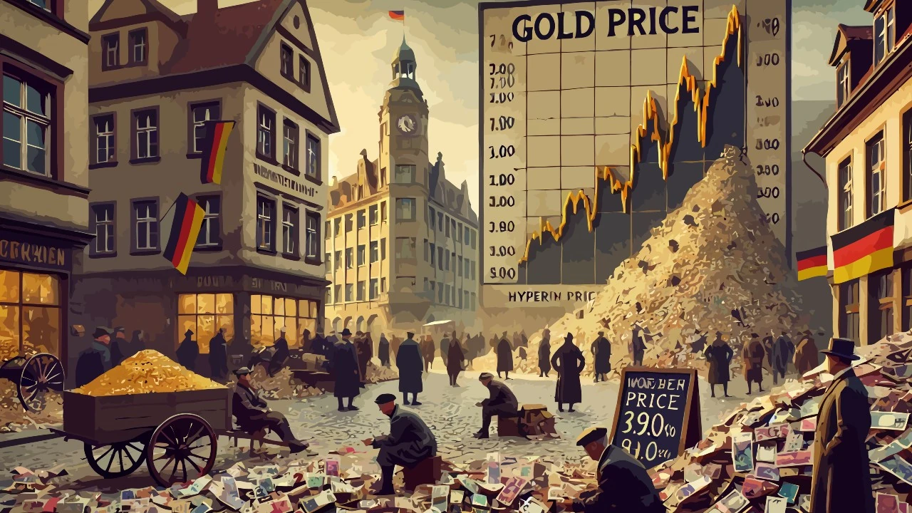
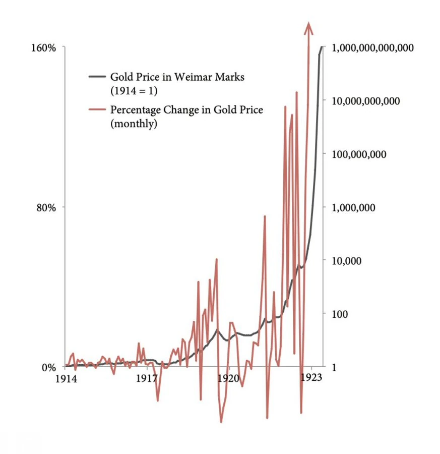
I recently noticed a graph that correlates the monthly percentage change in the price of gold with its absolute value in the Weimar Republic between 1914 and 1923. Looking at it quickly, one gets the initial impression of being in front of a crazy system, dominated by violent positive or negative oscillations and without logic. In reality, appearances are deceiving and now I will explain why.
A closer look, however, reveals a behavior that is anything but chaotic. The key data to observe is that, despite the apparent visual symmetry of the graph, the downward retracements never fall below -30%. This means that, even in moments of pause or slowdown, gold has never experienced a real collapse. What appear to be “descents” are actually just moments in which growth has temporarily stopped, without ever becoming negative for too long. A monthly variation value of 0% does not in fact indicate a loss, but only a standstill.
Gold price in Weimar marks in relation to its monthly variation.
The real information that the graph conveys is not that of a roller coaster of ups and downs, but rather that of a powerful and unstoppable rise in the price of gold, punctuated only by short periods of consolidation. The monthly oscillations, although large, do not erase the direction of the main trend: during the hyperinflationary period of the Weimar Republic, gold continued to rise with impressive consistency, acting as a lifeline in a context in which the national currency was losing its value every day.
In this context, the graph is not just an economic analysis tool: it becomes a lens on the collective psychology of an era. The small retracements are not signs of renewed confidence in the mark, but simple breaths in a bull run that has accompanied, month after month, the collapse of the currency. Understanding this detail completely changes the reading of the image: no longer an alternation of highs and lows, but a constant inclination upwards, broken only by pauses that are not very significant overall. In times of extreme instability, gold has shown its nature as a fixed point. And the graph, if you know how to listen to it, tells this story with implacable precision.
The gold chart in hyperinflationary Weimar can be misleading, giving the impression of a violent and chaotic oscillation. In reality, the declines are limited and the rise is constant. It is essential not to be misled by the emotional appearance of the curves. Only by reading the data in their context can one grasp the true meaning. A scientific, not a reactive, view is needed.


Leave a Reply